Cerafiltec
Welcome to the Ceramic Era
Water is the most permanent resource on Earth. Yet for decades, the industry has treated it with solutions that degrade, clog, and need replacing every few years. The people behind Cerafiltec invented and patented the ceramic flat-sheet membrane – a module design now used by ceramic membrane suppliers worldwide. But the brand didn't yet carry the weight of what they'd built. How do you create an identity worthy of the company defining the future of water treatment?
Ceramic is the future of water treatment. Everyone in the industry knows it. What Salz & Water helped us do, is turn that conviction into a brand that is as permanent and uncompromising as our technology.
The challenge is explaining why ceramic membranes are simply better. Not just technically, but fundamentally. The Ceramic Era gave us a language the whole organization could rally behind. For the first time, our marketing and our convictions are the same thing.
Our story doesn't start with a membrane. It starts with a cosmic perspective: water has shaped our planet for billions of years. Now it's on us to carry it forward. Everything else follows from there.
Brand Strategy isn’t invention. It’s framing. Cerafiltec had been defining the future of ceramic for years – the work was to find that truth and give them the voice to claim it. When the foundation is real, the creative has somewhere to stand.
Ceramic isn't a feature. It's the future.
Cerafiltec didn't just need a new logo. They needed a new position in the world. We built a brand platform around one idea: The Ceramic Era. Not a campaign. A declaration that the industry's future belongs to ceramic – and that Cerafiltec is the one defining it. This narrative became the north star for everything from corporate decks to a brand film we called "The Voice of Water," designed to move even those who've never thought about water treatment.
Designed to outlast the industry
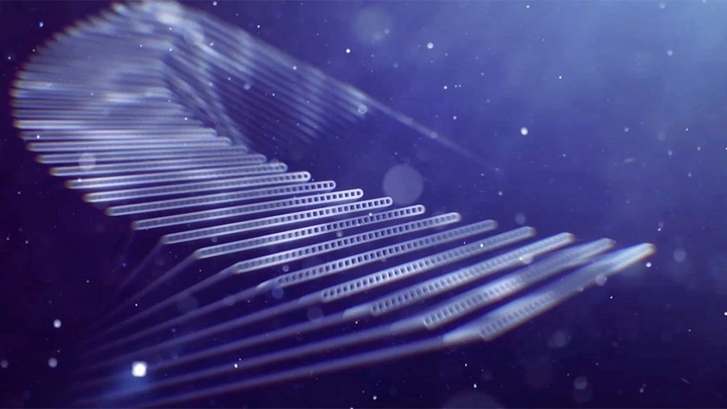
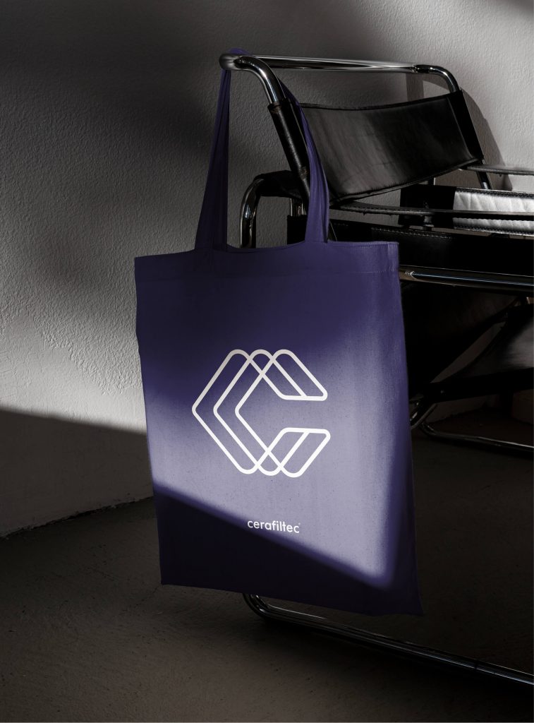
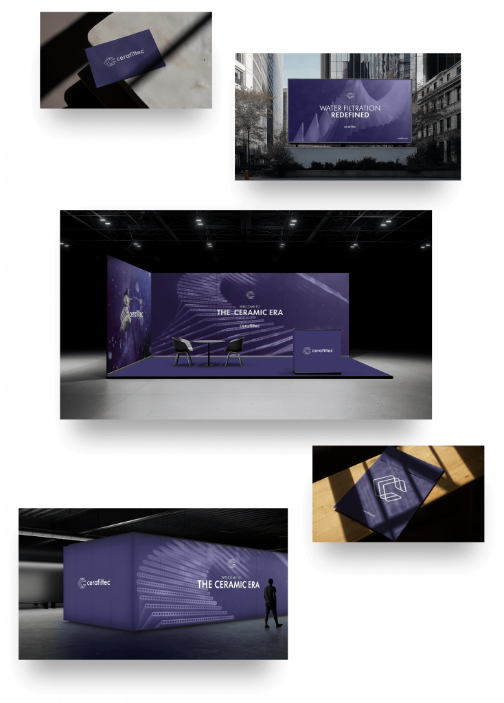
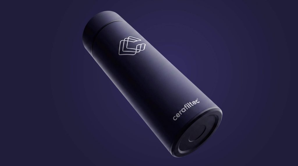
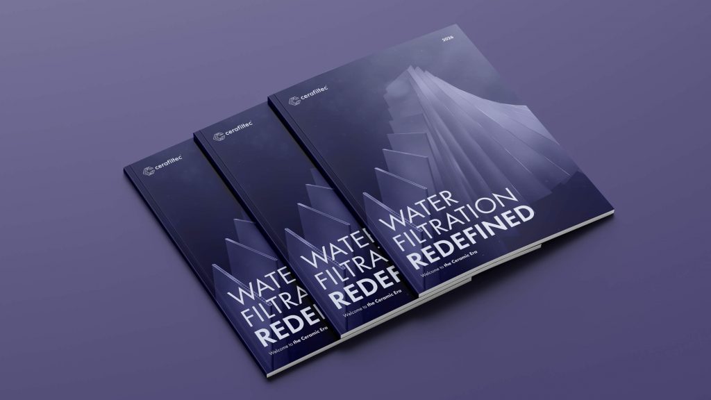
A brand platform built around permanence couldn’t afford a visual identity that looked like everyone else’s. The new symbol – interlocking ceramic layers forming a “C” – was designed to carry the same quiet authority as the technology itself: precise, structural, unmistakable. Cerafiltec Navy replaced the industry’s predictable palette not as a stylistic choice, but as a signal. This is a company that doesn’t follow the category. It defines it. The result is a design system that holds from business cards to trade fair stages, from social media to keynote presentations. Built, like the membranes themselves, to last.
_
Client: Cerafiltec
Category: Brand Strategy, Brand Identity, Brand Narrative, Film Production, Design System, Digital Design
Year: 2026