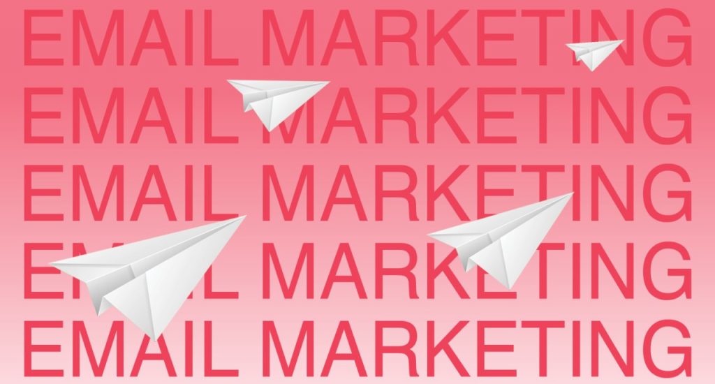
Here’s why fonts are so important for your business.
Fonts can make or break your brand image.
A bold statement, pun intended, and yet unquestionably the truth. Remember the collective anguish of industry professionals and regular movie-goers alike as the title for the Hollywood film AVATAR was revealed back in 2009 – in Papyrus?
A calligraphy-based creation from 1982, Papyrus was so widely available – and both overused and improperly used – it had become a parody. Watch the SNL skit here. The Papyrus anecdote is well-known but illustrates a point – fonts can provoke extreme emotional responses.
They have the power to elicit a strong reaction from the viewer before anything is even read in context and can trigger feelings like nostalgia, reassurance, warmth, and professionalism. (Or, in the case of the tribal-style Papyrus, disdain.) Fonts are also the harmonising element between copywriting and design – the glorious layer of butter spread between toast and jam; the yoghurt binding your chopped fruit and granola; or the paper to your rock and scissors.
Your brand is a vehicle for communication, and the ideas you wish to convey are shaped by the letters and words your audience sees. They strike a balance between the meaning of text and the mood, feel, and overall visual tone.
How do we define a font?
Its etymology can be traced to an old French noun Fondre from the 16th century, meaning to cast or melt something. Picture a rugged blacksmith pouring molten metal into moulds, hot rock sizzling beneath their gaze as they grunt under the weight. Morphing over the years, it became associated with the printing revolution, and the advent of letterpresses and ink imprinting.
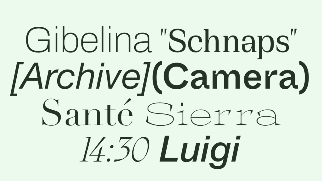
In present-day usage the word has a slightly nebulous definition, as people often employ it interchangeably with ‘typeface’. The latter refers to structured serif or sans serif letter forms, characterised by a range of unifying design features.
For the uninitiated, a serif is a typeface featuring little flourishes or extra edges on the ends of the letters – typically thought of as more traditional, classical, or ‘ornate’. These extra edges function as a simulation of lines when multiple letters or words sit next to each other, improving readability. This is why most books or text passages featuring long text are set in serif fonts. A sans serif omits the additional strokes on the letters and is referred to as more contemporary and minimalist.
‘Font’, on the other hand, denotes the size, weight, kerning, angling, and character (Roman, Cyrillic, Greek) of the letters – in essence, the granular details. A typeface may consist of a collection of different fonts. As such, fonts – with their different weights and angles – are incredibly versatile and can alter the feel of a typeface dramatically. Three of the most popular typefaces ever used are Helvetica, Calibri, and Futura. Between them, they have been used by perhaps hundreds of different brands and businesses.
How many work documents have you seen featuring the Microsoft-designed Calibri? Did you notice how Google themselves have a logo bearing a strikingly similar resemblance to a Futura typeface?
Have you seen the feature-length documentary called ‘Helvetica’ by filmmaker Gary Hustwit?
The effect of the subconscious.
A study conducted by filmmaker Errol Morris in 2012, in collaboration with the New York Times, surveyed readers to measure the impact of fonts and typefaces on the perception of truth. After testing his theory on thousands of people, he concluded that Baskerville (an old, traditional serif) was more likely to convince them of the veracity of the writing than a range of others.
The study suggests a subconscious connection between fonts and shapes and values or feelings. They are a visual representation of a particular standard or ethic – in this case: truthfulness.
The Gestalt principles.
The Gestalt principles of design are routine reading for most designers. It theorises a set of rules for how we see things, based on concepts such as proximity, similarity, continuity, grounding, grouping, and more.
The underlying message is that humans see grouped objects rather than individual ones. We create something whole by connecting dots for ourselves – sometimes filling in empty sections of the picture through our subconscious.
From this angle, fonts are a crucial aspect of brand-building because they help create an overall aesthetic – eliciting either an obvious and deliberate response from the viewer or one that is more intuitive. They represent more than the sum of their parts.
To keep in mind.
Recognising how fonts have the subconscious power to influence the perception of your brand helps you to think more carefully when you’re searching for the right one.
A font shouldn’t be an afterthought or just a line to cross off on your to-do list – it should be thoughtful and deliberate. What sentiments do you wish to convey? How does it reflect the purpose and general ‘feel’ of your company?
While it’s easy to get excited about artistic and fantastical font designs, don’t forget that it should also serve your needs on a practical level. Your font can be as outside-the-box, whacky, understated, bold or sophisticated as you want, but it has to be readable for your audience and legible in whatever context you place it. If nobody can read the words, then your font isn’t doing its fundamental job.
Useful resources and inspiration.
We asked our graphic designers to share their current favourite typefaces as well as useful resources to get you going. One of our primary sources of inspiration for all things font related is: www.fontsinuse.com, where you can search across a huge inventory. The great thing about this site is you can see examples of each one in different use-cases – as article headlines, newspapers, tin can stickers, posters, signs, and more. They also provide descriptions on each one, and run a blog where you can learn about specific fonts and their cultural significance.
If you want to find out what’s trending in type, take a look at Typewolf: https://www.typewolf.com/resources, where you can find links to a range of useful resources and educational touch-points.
Google Fonts (https://fonts.google.com/) is also a useful place to test out new ideas – the fonts are all open-source and the page offers a smart filtering technique so you can navigate efficiently.
Yoshi’s favourite typefaces at the moment:
LL Riforma
https://lineto.com/typefaces/riforma
Crafted by NORM, a family of five weights with a distinctive angled cut on the terminals of particular letters.
Rhymes
https://maxitype.com/typeface/rhymes/
Drawn by designer Jakub Samek, Rhymes is a “contemporary synthesis” of Times New Roman and Times Book.
Metaballs
https://maxitype.com/typeface/metaballs/
An outside-the-box creation based on optically balanced curves and balls “relying on mathematical principles.”
Mihai’s favourite type foundries:
Tightype
https://tightype.com
An independent site with an emphasis on “visually strong, contemporary” type design.
Colophon
https://www.colophon-foundry.org
Custom and retail typefaces for analog and digital media, focusing on a combination of “aesthetic and technological care.”
Klim
https://klim.co.nz/collections/epicene/
Look out for a really artistic and intriguing new collection called “Epicene.”